Data, in simple language, is the name given to basic facts like names and numbers. Time, dates, weights, prices are some simple examples of data. Handling data interpretation questions is not difficult. However, it is important to be clear about the basics. Data interpretation is one of the important aspects of almost every competitive examination. Consequently the success in the examination depends much upon the candidates performance.
Methods of presenting Numerical Data :
Four principal methods of statistical data presentation are
(1) Tables
(2) Bar Graphs (3) Pie charts or (circle graphs)
(4) Line graphs.
Tables
Tabulation is a common method in data interpretation.Tables is an arrangement of data in rows and columns. It provides an overall view of the situation and help in the process of decision making. Sometimes, the columns in a table are subdivided to give further information. Generally, it is easier to process the data in a table having more number of rows than columns.
| Subjects |
1st term |
2nd term |
3rd term |
| Chemistry |
70 |
75 |
80 |
| Physics |
65 |
75 |
90 |
| Maths |
75 |
80 |
90 |
| Biology |
85 |
80 |
95 |
Bar Graphs
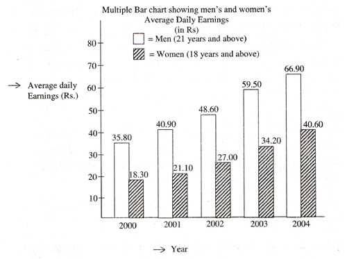
A bar-diagram is essentially a graph converted into and presented in the form of rectangular blocks called as bars. These rectangular blocks have common width and hence are proportional in value as per their lengths. It may not present information as precisely as a table but it gives a quick overall impression of the findings.
Different type of bar diagram are listed below
(1) vertical bar-diagram
(2) horizontal bar-diagram
(3) Multiple bar-diagram
(4) subdivided bar-diagram
(5) Deviation bar-diagram.
Bar diagrams are also known as column graphs. A simple bar diagram is given below.

Pie Charts
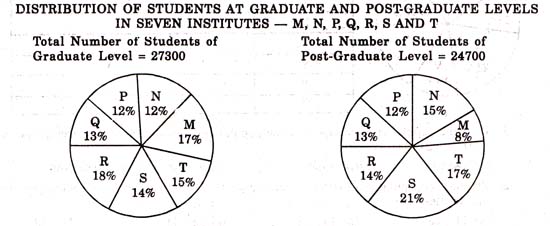
This is one of the most commonly used method of pictorial data interpretation. Pie charts show the relationship of parts to the whole. The central angle of a circle is 360°. The proportion that each part bears to the whole will be corresponding proportion of 360° , which is required to be calculated. Pie charts are useful for representing
(1) percentages of various elements with respect to the total quantity.
(2) proportion of various elements with respect to the total quantity.
(3) shares of various parties of a particular quantity.
Note :
In a pie chart, 100% = 360° hence 1% = 3.6°
and 1°= (1/3.6) %

Line Graphs
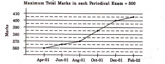
It is a linear representation of the figures, put on a two-dimensional scale and show a relationship between the figures on the two axes, via x and y. It is one of the simplest and easiest way of showing data interpretation. It is drawn on graph paper to a certain scale. Each reading is plotted on the graph and points are joined with ruled lines.
Different types of line graph are
(1) one dependent variable
(2) more than one dependent variable
(3) Graph having two scales
(4) frequency polygon
(5) cumulative frequency polygon and
(6) greater than frequency distribution.

Questions which comes into mind by reading the above data interpretation captions are
(1) Overall growth / decline in terms of %.
(2) Proportion of one quantity to others.
(3) Which quantity contributes the maximum / minimum ?
(4) Consistency of values over a period of time ?
(5) Average computations etc.
Note : In answering such questions, adopt comparison method, rather than performing detailed calculations.
Click here for more data interpretation questions with detailed explanations